
Lichen Apparel
My Role (independent)
UX Research, Information architecture, Branding, UX, UI
Timeline
6 weeks, 20 hours per week
Tools
Figma, Zoom, OptimalSort.com
Background
Lichen is a clothing store that was established in 1994. The stores offer affordable clothing for any occasion, accessible to anyone. They have had many years of success with their brick-and-mortar stores, but want to expand to have an online store.
Challenge
Design a responsive eCommerce website that is easy to use and that allows customers to browse through all products and filter by size, color, style, and others. In addition, design a new logo and branding that is modern and neutral.
The solution
A modern and successful responsive website was designed for Lichen, with a shifted focus on sustainable branding and offerings.
Note: This is a project I completed for Designlab. Lichen is a fictional clothing company but the research and design was based on real user voices.


Research
Step 1
Goals
1. Identify why people shop online vs in person
2. Determine what factors in an online experience lead to a purchase
3. Identify what features are most important for an online shopping experience
4. Identify what branding works best for an eCommerce clothing store
Methodologies
1. Competitive Analysis: Research and better understand trends, strengths, and weaknesses in competitor online clothing stores
2. 1:1 Interviews: Understand customer’s likes/dislikes, wants/needs about online shopping.
3. Observation: Review a comparable site and chat through the process, pain points, and check out steps.
Fast Fashion heading to sustainability?
For my competitive analysis research, I chose comparable fashion brands that are popular, affordable, and have an online presence. I expected to see more similarities in the sites, but each had quite a lot of variance in the user paths and interfaces.
I also noticed that brands I previously considered to be more fast fashion were beginning to shift focus to more sustainable clothing options and ethical branding.

Listening to and watching shoppers
My next step was to interview and observe some consumers. I needed to learn about their habits and discover what makes them confident to purchase in an online shopping experience.
I interviewed 5 participants, age 30-45, who ranged from very frequent online clothing shoppers (more than once a month) to those that only shop online every few months.
Some expectations and results
Are users actually interested in sustainable products?
I wanted to confirm if sustainability was something users were interested in after seeing comparable brands with this focus. To do so, I made sure that the observation portion of the interview was on a site that did have an ethical focus.
4 out of 5 participants did react favorably to sustainable clothing options and ethical branding.
Quality over price?
Something that surprised me was how clothing quality (fit and materials) was more important than price–3 out of 5 participants were willing to pay more for a product because they expect the quality to be much better and more consistent.
With the uncertainty of not seeing something in person, it seems that customers are paying more for online options to avoid the hassle of returns.
"I'm trying to be better at shopping at [online] stores that take an ethical stance and have a diversity statement."

"I hate not knowing if something will look good or fit right, so I try to shop at places I have gone to in person before."
Further insights
Customers need confidence
Since users can't feel or see how something looks on them when shopping online, relying on sizing descriptions, quality explanations, and understanding return policies is key. Ensuring these are clear and helpful is very important to give users the confidence to check out.
Users want an "easy" experience
Online clothing shoppers need to intuitively and efficiently find what they want. For inexperienced and experienced online shoppers alike, it means non-overwhelming sites with clear interface paths and personal touches.
Sustainability is not just the future…it’s now
Not all users are exclusively shopping for sustainable clothing yet, but low quality/fast fashion brands are becoming less popular. In addition, more customers are investing in quality–this goes hand in hand with sustainability (better materials + better sourced). It is worth investing in this direction.
Speaking with Stakeholders
If this were not a conceptual project, it would be at this point in the process where I would want to present my research findings to the company stakeholders and leadership team. Due to the research presenting such a need for a brand shift towards sustainable products, I would want to work with the client to determine if this is a feasible move for the company.
I understand extensive conversations would need to be had, along with much more intensive research–especially since this shift would impact not only the website branding but the physical product itself.
Since this is a hypothetical project, and since the real user research indicated it would have a positive impact, I decided to move forward with a product that does focus on sustainability, while addressing other core UX needs.
Define
Step 2
After the insights from the initial research, it was time to better understand potential users and what they need from the product.
Learning from the Persona
Before the initial research, the persona I had in mind might have been more of a bargain hunter. After the interviews revealed multiple users having more interest in quality and ethical clothing, it seemed best to create the persona, Pauline, to better empathize with the modern online shopper.
Pauline is a busy 32-year-old professional who wants to find higher-quality clothing brands to keep going back to. She is a quick shopper and goes online when she knows she needs an item but doesn’t want to get hung up in any complicated processes.


Categorizing clothing types
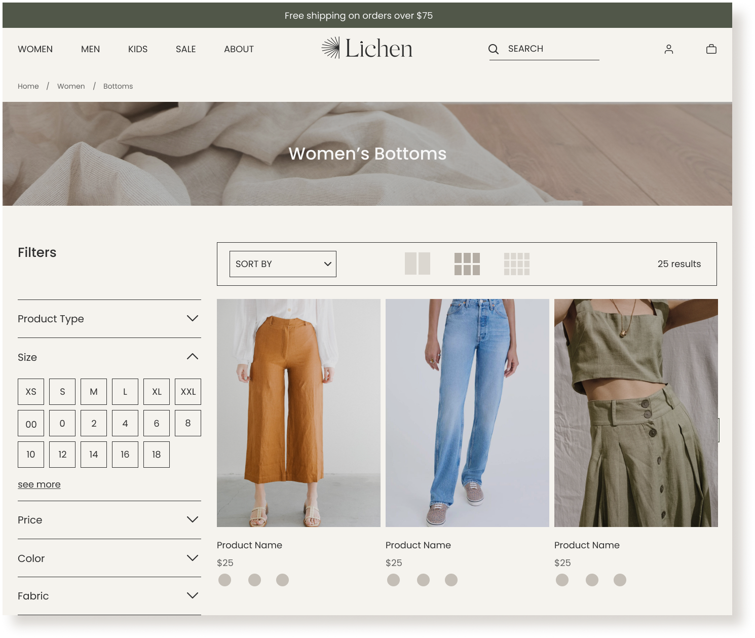
To determine how the site architecture would best support the users, I conducted a remote open card sort. There were 30 cards, each displaying a clothing product–users sorted these into categories that made sense for clothing navigation.


Card Sort Insights
Those less experienced with online shopping seem to have gone by event versus a typical categorical name, so this supports the need for flexibility that helps novices and pros shop online.
Seems like each end of the clothing spectrum–Casual and Formal/Party–seem to be more similarly categorized. The items in between are more fluid and had less obvious sorting patterns. This supports my plan to have items that are more ambiguous be sorted under multiple categories. Example: Plain leggings can be found under athletic/athleisure, casual, and bottoms.
Information Architecture
Based on the previously gathered insights, I was able to build the sitemap and task/user flows to better define the information architecture of Lichen.


User Path
With the supporting research, it felt important to have the user path have a simple and clear path to checkout. I also made sure to show a way for the user to find sizing and quality information, as well as the company about page to learn more about their ethical practices.

Ideate
Step 3
After research and defining our users, it was time to start designing the responsive site and branding.
Initial Wireframe Sketches
I wanted to explore many different options in the initial sketches. I created a few different versions with a variety of layouts, planning to combine the options that felt strongest for my digital wireframes.
Based on the user research, I felt it important to keep the following in mind while making my sketches:
Highlight easy return process to give confidence for online confidence
Create transparent quality + ethical call outs
Include varied and high-quality product images

Mid-Fidelity Wireframes
As I built out the wireframes more fully, I found it important to start determining what content would take prioritization on the pages.
For the homepage content, it was clear from the research that sustainable/quality callouts should be high on the page, letting users know about the brand as soon as possible. Return information would benefit from being high on the product pages, but still should be highlighted on the home page.
Users are visiting this page to shop, so it was also important to highlight the best sellers right away. Trending item callouts were placed lower on the page, as I did not have concrete research on how users felt about this–later research would actually show that this section should better prioritize sale items, which can be seen now in the final prototype screens.


Branding
The initial goals for the branding were to create a modern and neutral design that creates a trustworthy experience for all users. The research supported this need, and additionally, a want for ethical products–with this in mind, I wanted to be sure the logo and UI Kit represented this as well.
Designing the logo
My goal was to have the logo design abstractly represent the word Lichen–a moss-like plant often found on trees. Since research findings supported a need to shift focus more towards sustainability, a logo representing the growth of a plant is a nice touch.
I started with a simple shape, showing a burst of abstract lichen branches, in a few different shapes and orientations.

I settled on a higher arch shape with a wordmark for the final logo. The more organic shape better represented the brand goals, and the customized Silk Serif font for the title of the brand added a modern elegance.
The “i” and “e” in the wordmark were customized to match the arch of the logo, pairing the two together in a subtle way.

Continuing with the same theme of an organic, neutral brand, I chose fairly minimal colors for the brand styling. The research supported a need for an uncluttered and clean design, which meant keeping things simple and not overwhelming. I decided that an olive would work well as the main accent, with a few light creams as secondary colors. The olive is a nice tie-in to sustainability, as well as the name Lichen. The colors together create a trustworthy and calming effect.
Since the wordmark was an elegant serif, I wanted to keep the main site text a sans serif. The font Poppins paired nicely and kept with the wishes of the user and company to have a modern and practical design.

Full UI Kit
Expanding on the style tile, I built out a fairly robust UI Kit.
Photos were borrowed from Garmentory.com, and the theme of organic, airy, neutrals continued with the product images–the models had textured, dreamy backdrops that included objects and non-static poses.

Making things responsive
Now that the branding had been decided, it was time to create high fidelity responsive wireframes for desktop, tablet, and mobile screens.
A few notes about my design decisions:
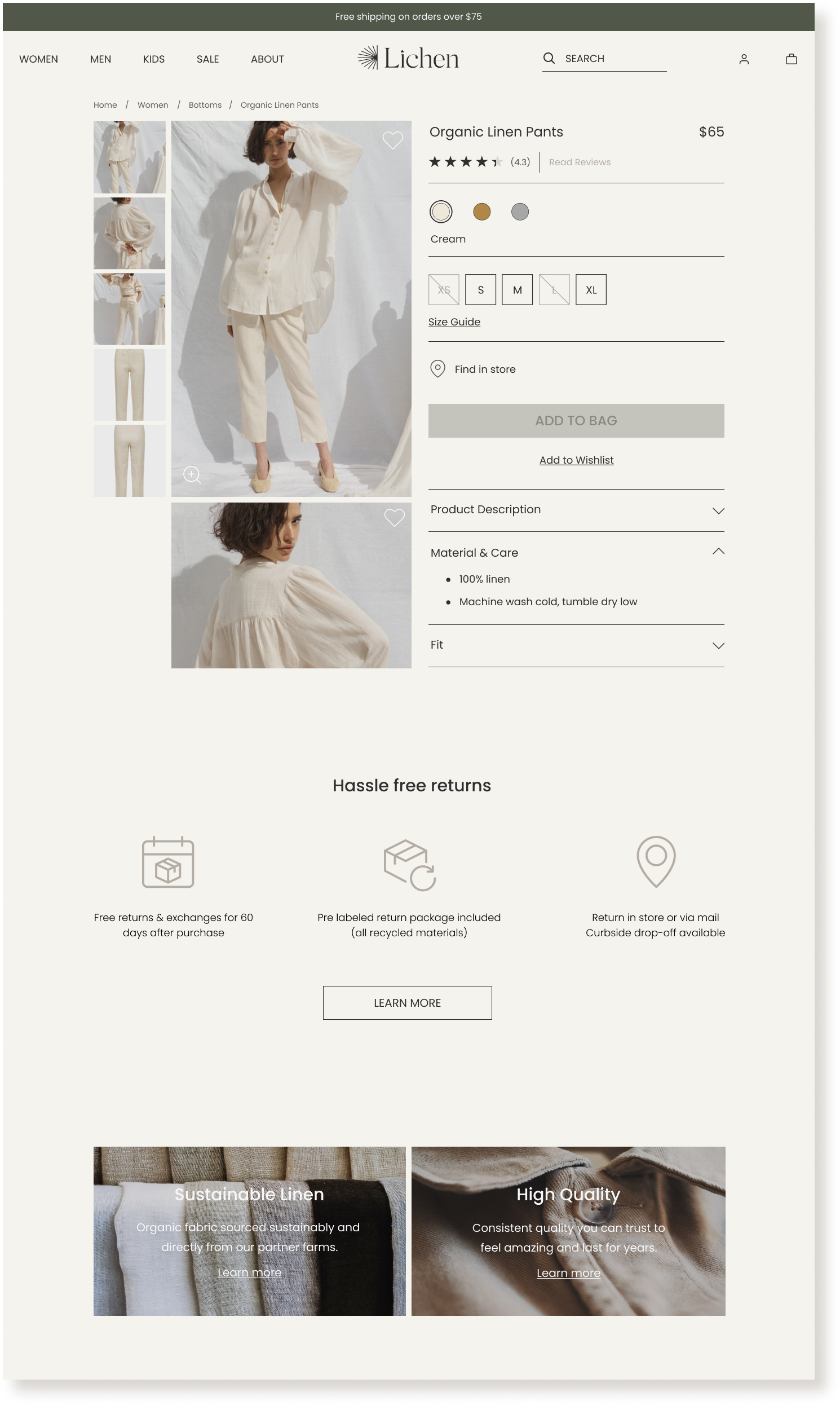
Quality and sustainability call outs were placed high on the home screen and throughout the product page, based on the research indicating a positive impact with that shifted focus
Easy return process called out lower on the homepage, but high on the product page–added to increase user confidence in purchase and trust of the brand in general
Women, men, and children offerings throughout the homepage to support a variety of potential users and give them product offering information early
White text over the product images was used to add to an airy, ethereal theme–will be easier read with hover state overlay in prototype

*All product photos borrowed from Garmentory.com
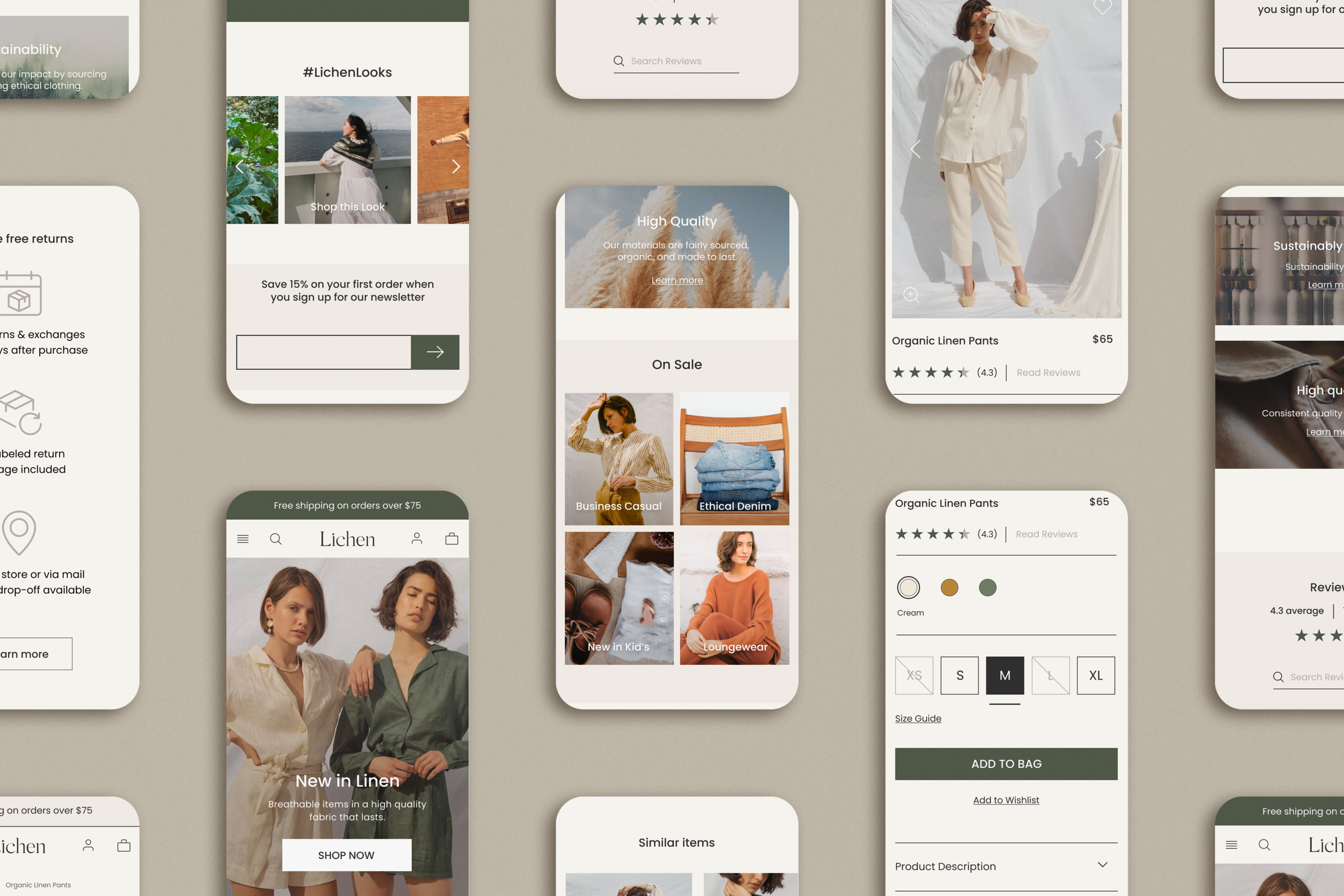
Prototype
Step 4
Once the screen designs were finalized, the next step was to create a clickable prototype that would allow users to
use the main navigation to look for items
filter and sort through women’s offerings
select a product and view the product information
add the item to your cart and checkout
Filtering
There wasn’t clear insight from the research on whether customers preferred filtering for products over searching, but what was conclusive is that users can easily be confused by complicated options. I wanted to create an intuitive accordion for the filter options, and found this challenging with Figma’s prototype options–in the end, I think the final result presented a fairly natural accordion, that would only be improved in development.

*images shown are before testing and final revisions, which can be seen in final prototype
Adding items to the cart
Based on the research, users needed to trust a few things before checking out with a product: the quality, the size, and the brand in general.
To make sure users felt this in the prototype, I wanted to be sure that they could easily find the material information of the item, as well as a link back to the general quality information if the user continued scrolling below and past the product. Reviews are also linked at the top of the page and below, aiming to give the user more confidence in purchasing.
A size guide is linked next to the size options, which if expanded on, would show a few options–a standard measurement guide, as well as a fit comparison guide for those that don’t know their measurements.

*images shown are before testing and final revisions, which can be seen in final prototype
Final prototype

Test
Step 5
Usability test: 4 participants, age 30-50, have shopped online for clothes within the last month
Test Goals
Test the usability of Lichen’s desktop website navigation
Discover if the website provides enough information for confidence in purchasing
Test how the user interacts with category/filtering
See if the user can add an item to the cart & checkout successfully
Identify if there are pain points/confusing elements that need improvement/adjustment
Determine if the brand update was successful (design, modernization, overall tone, etc)
Testing for success
The usability testing went well, and based on the feedback and reactions of the participants, the Lichen brand update and responsive website design was a success for the user.
All participants were able to understand the task flows easily and navigate throughout the prototype without assistance. Users reacted favorably to the brand and overall tone, describing the site as “comfortable, airy, thoughtful, earthy, and trustworthy”.
Opportunities for Improvement
There were a few points of confusion. Participants pointed out some inconsistent copy from page to page, which just supported the need to make things as consistent as possible. Users preferred copy on quality and sustainability, in particular, to be the same from page to page. Otherwise, they assumed the links would go to different places.
Another point of confusion was the prototype itself–there are a few quirks with the hover effect that I realized, after a few hours of research, were currently unavoidable due to the limitations of Figma. I now understand the need to explain to participants that any “prototype glitches” can be ignored, but to still point them out.
“I would definitely buy from here…I feel like I can really trust the quality of the clothes.”

“I always expect some things to not fit, so it’s nice to see that the return process is super easy.”
Final Testing Insights
Task Completion
(find category page, filter, add an item to the shopping bag, checkout)
100% completion rate
Flow easily understood
Brand update successful
Users like the design of the site
Feel like they can trust the brand and purchase confidently
Users respond very well to sustainable and quality aspects
Users find the experience enjoyable and comparable to other online shopping experience
Things users found surprising
Pattern filter
The site seems very nice towards the user (good discounts, no pop-ups/pushes to sign up)
Scrollable product images
No sale section highlight
Priority Revisions
Based on the test insights and affinity map, I determined the most feasible and important revisions that needed to be made. They mostly consisted of simple copy updates, but some design changes to the product page, in particular, were more robust.
These revisions are finished and can now be seen in the final prototype.
Global
Adjust copy and make it more cohesive across pages
ex: sustainability/quality promises, wishlist/save for later
Homepage
Update newsletter sign up to be account sign up
Remove period from the learn more sections
Swap out trending section for sale
Category Page
Consider dropping pattern, seems confusing to users
Add price filter
Grid view was pointed out as interesting or odd by 2/4 users. Consider changing/removing
Product Page
Users confused with photo scroll vs click–adjust to be just scroll
Size Guide was missed by 2/4 users. Make this more visible with proximity
Remove shipping & returns section in accordion as it is below in more detail
Shopping Cart
Adjust ‘save for late’ to be ‘add to wishlist’. Copy is currently confusing
Quantity in 2 places. Adjust to just be dropdown
Checkout Screen
Add back button so users do not feel lost or trapped
Retrospective
In conclusion
It was not necessary to change the game of online clothing shopping for Lichen–users, especially during a time of isolation, know how to checkout with something they want. But making a transparent and trustworthy experience was a worthy challenge for my first full UX project.
What I loved about this project is that Lichen began as a bargain-based, fast fashion brand–but then after real user research, it became clear that the need to adjust the focus of the brand to an ethical and transparent company was more important to modern digital users. As mentioned earlier in my case study, I know in a real-world project, this sort of shift would be a very important decision for the company–but I really enjoyed designing a successful solution, based on two rounds of thoughtful research, as if the company had given the green light for a sustainable shift.
If I had more time
I would love to go back and test the updated prototype now that the priority revisions are complete. I believe it would result in even more confirmation that the branding and site experience was successful, but hopefully, find a few more items that need attention and can bring this to an even better spot for a hypothetical handoff.
What I learned
Low-fi before Hi-fi. Due to inexperience, I went with a higher fidelity wireframe that luckily did not change too much from the initial design, but I understand that in a team/company-based setting there could have been multiple changes that would have been more time-consuming to change in the higher fidelity design.
Observation is key. Thanks to my mentor for this suggestion, but I found this so helpful as a supplemental part of the interview process. Seeing how users interact directly with competitor sites, especially with regards to filtering and sizing, helped me see pain points in action and hear what users wanted instead.