
Forage Meals
My Role (independent)
UX Research, Information architecture, Branding, UX, UI
Timeline
4 weeks, 20 hours per week
Tools
Figma, Zoom
Background
Forage is a new local meal delivery service in San Diego, California that brings fresh, pre-cooked meals to its customers. Currently, the business owner is operating the business off of social media but is growing her customer base rapidly. She needs a responsive website that will be able to handle her business as it grows, as well as modern branding for the site and meal packaging.
The problem
Forage has a decent user base at the moment, but the word of mouth method for scaling is not sustainable and is currently limiting the type of users that are using the service. In order to seamlessly transition to a more robust website, the business needs to expand its user base. The responsive website must meet the needs of the current user, while also attracting a larger variety of customers, leading to consistent growth for the business.
The solution
A responsive website with cohesive and modern branding that is ready for a scaled business and future growth.


Research
Step 1
Goals
1. Identify what makes people interested in purchasing weekly, precooked meals
2. Determine what types of meals people are most interested in ordering (breakfast, lunch, dinner, sides, juices, etc.)
3. Identify what features are most important for a local meal delivery website
4. Determine what branding works best for a local meal delivery service site and products
Methodologies
1. Competitive analysis: Research and better understand trends, strengths, and weaknesses in the comparable meal delivery services
2. User Interviews: Understand customer’s likes/dislikes, wants/needs about meal delivery services
3. Observation: Use a comparable site and observe and listen to participant’s actions/thoughts
4. Survey: Expand on any inconclusive results from previous research
Time to Forage
Forage is a meal delivery service run by a professional chef who wants to bring healthy, fresh meals to her neighbors in San Elijo Hills, San Diego.
The service allows users to order from a weekly menu every Sunday through Tuesday, for delivery that Saturday. There are no order minimums, and no subscriptions necessary to order. With a little planning ahead, customers will receive exciting and restaurant-quality meals that they wouldn’t make at home.
To cook, or not to cook?
During the global pandemic, dining in has become the norm. For people who are stepping away from takeout, it is common to turn to meal delivery services. These types of services offer healthier, pre-portioned food, with higher quality whole ingredients.
Within the meal delivery landscape, there appear to be two varieties: meal ingredient boxes, that allow the customer to cook themselves, or pre-cooked and ready-to-eat meals.
For my competitive analysis research, I stuck to smaller and local San Diego services as direct competitors, but also looked at larger services and comparable services with a different focus.

There was a lot of variety in the competitors, but here are some patterns I noticed:
Subscriptions and order minimums
Half of the competitors I looked into required subscriptions, and 4 out of 6 required a weekly order minimum. Forage’s current business model is to bring customers in without forcing much commitment–this is currently working great, as the delicious offerings and easy process is what brings customers back.
Lunch and Dinner focus
While some competitors offered breakfast and other items, nearly all services only offered lunch and dinner primarily. This is in line with Forage offerings, as the business owner suspects people need the most help with dinner/lunch type foods. There is a lot of room for growth, and the site should allow the implementation of other meal types easily.
Health and sustainability
Healthy and diet-friendly options are highlighted by almost all of the meal services I looked into. Quality, local, and sustainable ingredients go hand in hand with this healthy focus and are the main drive of Forage’s business model. This is something that the current users are very positive about and should be a way to attract new users as well.
Digging further in to what people want
My next step was to interview and observe people who currently or have used a meal delivery service. With the time constraint of my course, I chose to focus on interviewing users who currently do not use the service. Since the business is brand new, the current base has only a few orders worth of experience to chat with me about. While this insight would be valuable for future research, speaking to customers who have more experience with other services will help offer insight into why they use or left the comparable service, and how we could design an experience that would convert them to be Forage customers.
I interviewed 4 participants over zoom, asking them questions about their experience with their service. I then observed them use a comparable website to hear and see, in real-time, what kind of experience they have with ordering from this meal delivery service.
Users want the freshest ingredients
This was something I expected from the outset of my research, but it seems to have been confirmed, as the want for fresh and quality ingredients was something I heard from every participant.
Speaking to the business owner, this was already her focus, but knowing the research supported it made it clear that I needed to be sure this fact was highlighted on the website.
Convenience is king, but at what cost?
Another point brought up by each participant was that this type of service sounds convenient, if expensive. Users want to make sure that they are saving time, but without losing too much money. If a service is more expensive than eating out, that seems to be a deterrent.
All users started their meal delivery service due to a promotion and most mentioned leaving the service after the promotion ended.
“There was so much packaging–it didn’t feel like I was cutting down on waste, but just producing more waste”.

“I prefer pre-cooked meals because I’d just got to the store if I wanted to cook with ingredients”
Further insights
People want to stop wasting
Since users can't feel or see how something looks on them when shopping online, relying on sizing descriptions, quality explanations, and clear return policies is key. Ensuring these are clear and helpful is very important to give the user confidence to check out.
Website observation
During the comparable website observation, it became clear that participants did not appreciate misleading photos of the food. They did not want to be swayed by pretty pictures, but rather see the actual food as it will arrive.
Points of confusion for the participants were both in the delivery and if the service had vegetarian, or other restrictive diet, options. Due to this, I wanted to make sure the site made these points very clear.
Users want interesting and exciting food
People are too busy to cook fancy meals at home and need convenient, but interesting, meal options. If paying for a service like this, users would rather have meals that are varied and not something that they can cook, or normally cook, at home.
How to bring users back
The main finding from my interviews and survey is that around 90% of my participants no longer use a meal delivery service. As I mentioned above, the main reason for that is price. Users said that a good promotion would make them interested in trying a service like this again, so I made sure to bring this finding to the business owner.
Another reason users do not try or go back to this type of service is that the subscription and order minimums are often confusing and misleading, resulting in a bad experience. I believe that not locking customers into this structure, especially at such an early point in the business, is a great insight that should reflect in the website.
Define
Step 2
After presenting the insights from the research to the business owner, it was time to better understand potential users and what they need from the product.
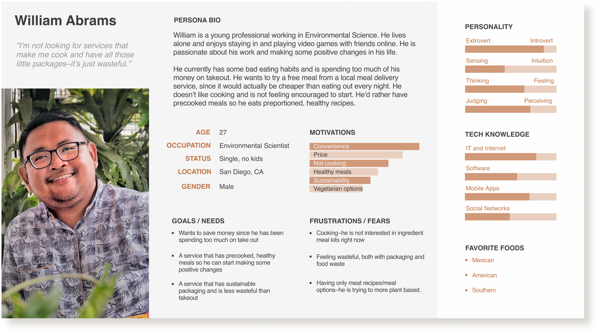
Current and future personas
Since the business already had a small user base, I had a decent idea of the typical user. That said, I thought it important to dig into the other types of users that Forage could potentially begin attracting, especially with a brand new responsive website.
Sally is similar to the current Forage user–a busy, professional mother who wants to use this service to save time. William is the type of user the business isn’t currently reaching–someone who is not interested in cooking but spends so much on takeout that Forage is actually a money saver. Also, he can find healthy, portioned meals an easy way to start an interesting diet.
By using both personas, I can better attend to the needs of the current user and also think about future users, and what types of different needs they have.

Determining the “order” of everything
Based on the previously gathered insights, I started to build out the information architecture of Forage, starting with the sitemap.
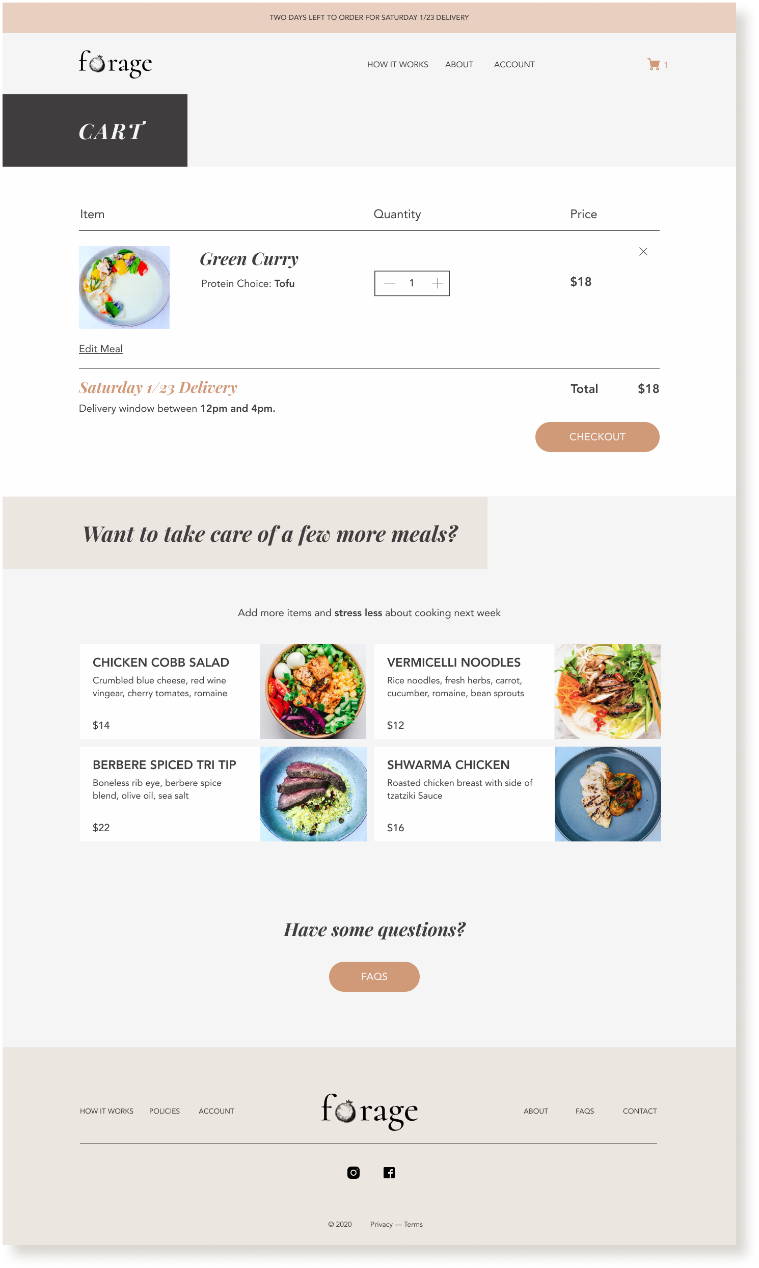
I found it quite challenging to determine the best way to have customers order–in the comparable services, most sites showed a menu separate from the order process because the subscription service did not allow you to pick and choose your food. Since Forage did not currently have a subscription service, it felt more intuitive for the user to add items to their cart from the menu.
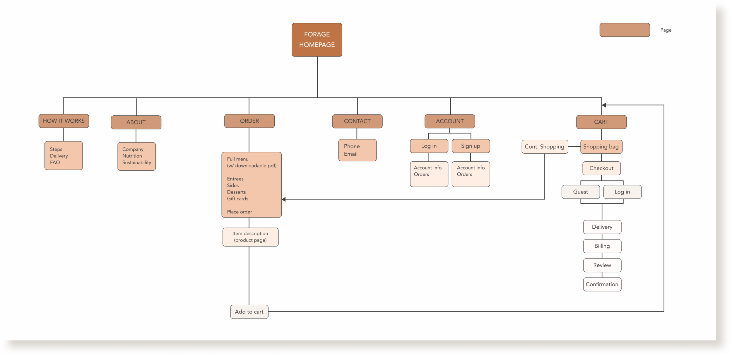
The Forage task flow
The main task flow of a Forage customer will be to add items to their cart and checkout. I broke down that task flow, including the process of signing up for an account, which would be typical for a returning customer.

Ideate
Step 3
After research and defining our users, it was time to start designing the responsive pages and branding for the site and packaging.
The Logo
The business owner had a very specific logo in mind, which I helped build upon to arrive at the final design today. We landed on “forage” in a lowercase serif font with a pomegranate as the “o”. The lowercase font decision was to help the business feel approachable and inviting, and the serif font combined with the pomegranate sketch bring everything together to a grounded and natural place.
Sketching the pomegranate
I wanted to start by sketching out the pomegranate, since that would be an important aspect of the logo, especially for the packaging.
Since Forage was a local, sustainable business, I wanted to reflect that in the pomegranate. With that “homegrown” feeling in mind, I decided to sketch the pomegranate as if it was a woodblock print. This was also influenced by the owner saying she planned to use the logo as a stamp for packaging, so I wanted to be sure the sketch had enough detail that would show digitally, but also translate in stamp form.
I used Procreate to sketch it digitally, and then vectorize it in Adobe Illustrator.
After finalizing the pomegranate sketch, it was time to pair the sketch with the serif font. I decided on Cormorant since it is a fairly neutral font with enough detail and personality to translate well as a stamp, but also hold its own on the website.
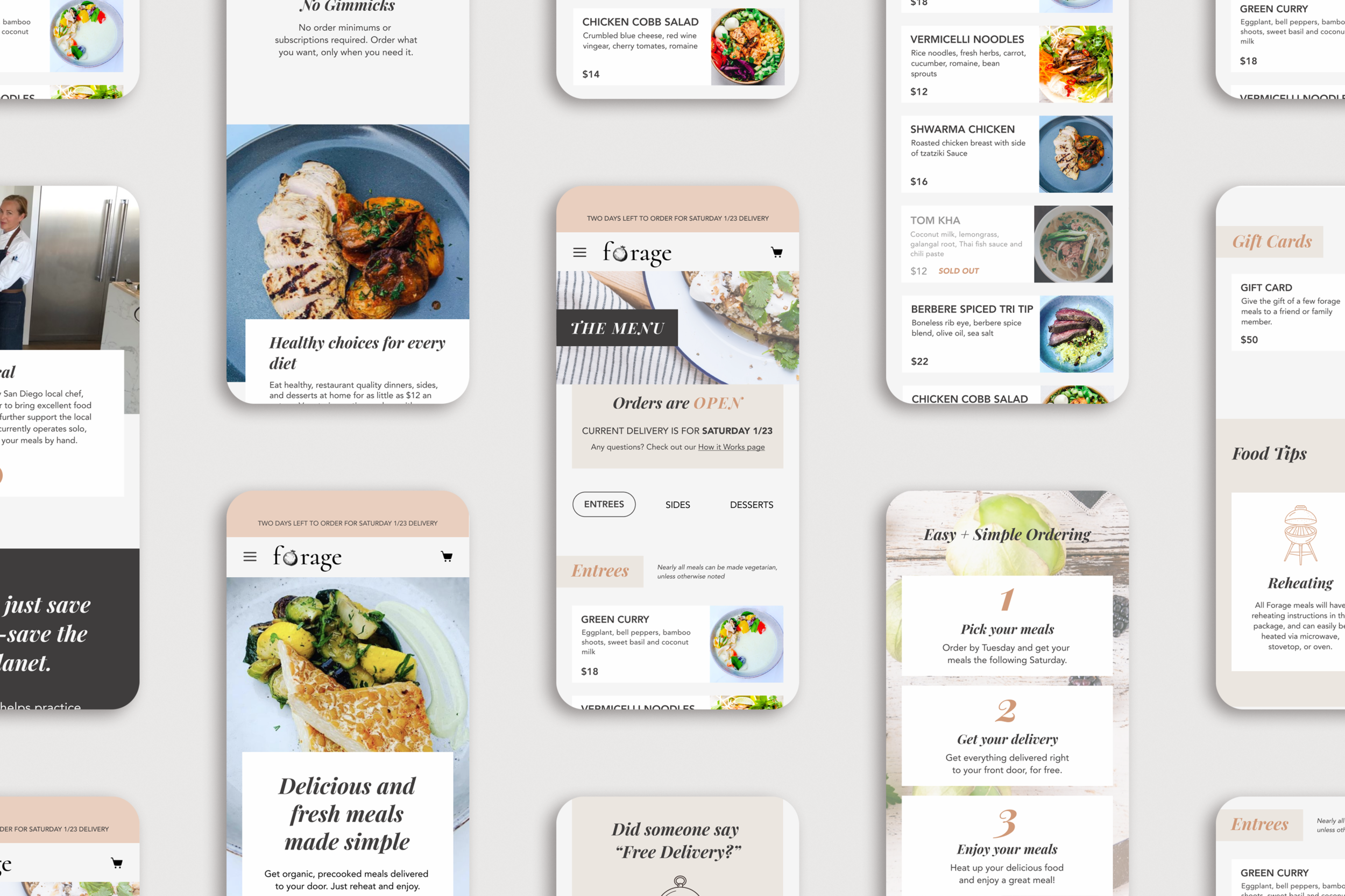
First iterations that were sent to the business owner.

After notes from the business owner, a style was narrowed in on.

Final iteration
After sending a few iterations to the owner and getting their feedback, I was able to settle on the final logo. I thought it important to keep things neutral, color-wise, since the branding color had yet to be decided.

Keeping things fresh while wireframing
Emphasizing fresh ingredients
Based on the research, it was very clear that users wanted fresh and local ingredients for their meals, so I wanted to be sure that was highlighted in the copy and multiple CTAs.
Making delivery process clear
Participants during the website observation made it clear that delivery was a bit of a pain point, and ensuring this step was clear on the homepage was important, and also detailed throughout the pages.
Calling out sustainability
Users mentioned disliking the wastefulness of all the packaging for delivery services like Blue Apron, so knowing that the business owner was taking steps to be sustainable was important to show on the homepage.

Style Tile
Expanding on the fresh and homegrown branding idea from the logo, I began building out the style tile for the rest of the website.
Colors
For brand colors, I wanted to keep things fairly minimal. Since the meals are the focus, I wanted most color to come from the vibrant food. I picked some warm neutrals and then decided on a desaturated orange for the primary accent color. The orange would stand out on its own but compliment different food images as well.
Images
Using consistent photos was a bit difficult when starting to plan the style tile. The business owner is still determining her style and the photos don’t match very well at the moment. This is something I will continue to update and work on as the business grows.
I chose to use some illustrative icons that matched well with the pomegranate. As the business grows, I would likely create a new set to be more specific towards Forage.
Fonts
For the fonts, the business owner wanted a trendier style for the header text. We decided on keeping the headers short and using a playful but readable italic style. Playfair Display was a good choice, as it is more readable than most and works well with the theme. Avenir was picked for the body text, as it paired very well with the header text.

Taking things responsive
Regarding the content, I focused on making sure the user would understand the service. Since current customers are used to a more casual order process through social media, it was very important to design a flow that would make everything an easy transition. In turn, keeping in mind that new customers don’t understand the service yet, it was vital to make sure “how it works” was extremely clear.


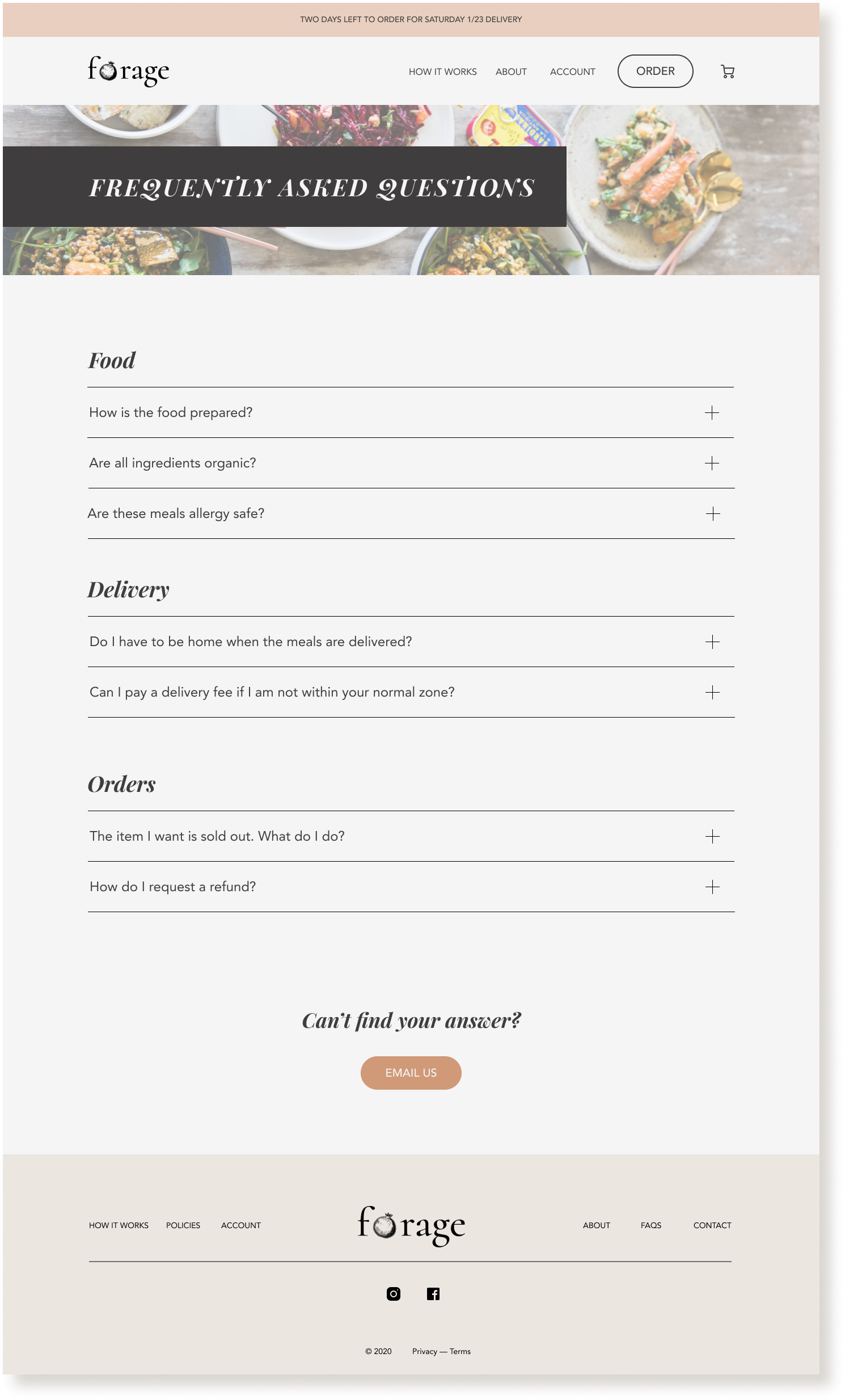
Clarity in how it works
A small “How it Works” section was fairly high up on the homepage, and linked to a much more in-depth how it works page. I wanted to give plenty of opportunity for clarity, both for established customers and potential new users.
Affordable and healthy
The delivery information was placed lower on the homepage, with a price callout taking its place. Thinking back to our new persona, William, and any future users, it seemed vital to call out how affordable the meals are, especially compared to takeout prices and comparable services.

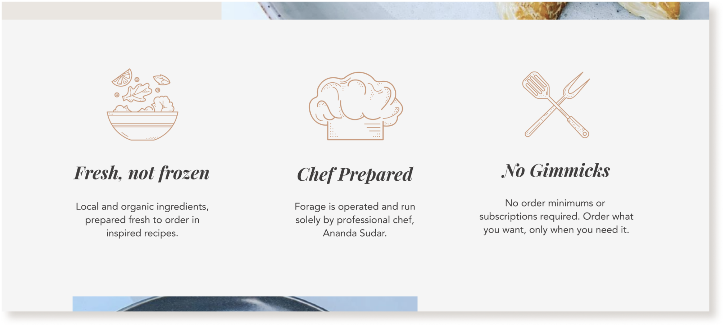

Illustrating the important features
Directly based on the user research, callouts for what made Forage stand out compared to the competition were placed throughout the homepage. Fun and illustrative icons were used to help bring attention to those.
Delivering convenience
While the pricing information was placed higher on the page, I also made sure making sure the free delivery callout was kept as well. A user could easily check if they live within the delivery window by just entering their zip code.

Ordering made easy
It made the most sense to make the ordering process through the menu page since Forage will have a weekly menu that allows a la carte ordering.
Taking special consideration for the mobile design was important, as most users mentioned ordering meals through their phone in the initial survey research.
Prototype
Step 4
Now that the screens were designed, the next step was to create the clickable prototype would allow users to
explore all pages, including the How it Works and FAQ page
go to menu page and see all meal options
add the food to your cart and get to checkout screen
But how does it work?
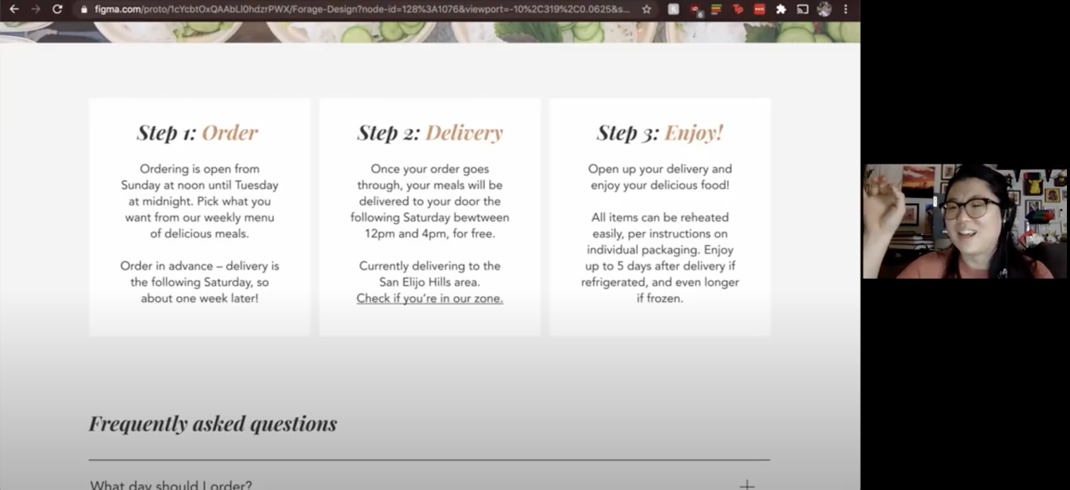
As I mentioned previously, I was a bit concerned the ordering window was not coming across clear enough. I worked on expanding the process explanation on a How it Works page, trying to clear up any potential misunderstanding. I added in a frequently asked questions section so if something still was not clear, users could find it there.
Due to this concern, I was going to be sure navigating to the How it Works page was a key part of the usability testing. Having participants interact and speak about their thoughts regarding this page would be valuable for discovering what information is slipping through the cracks, and then making improvements to this page based on that insight.

*images shown are before testing and final revisions, which can be seen in final prototype
Final prototype

Test
Step 5
Usability test: 5 participants–currently ordering, or have previously ordered, from a meal delivery service
Test Goals
Test the usability of Forage’s desktop website navigation
Discover if the website provides enough information for confidence and understanding in purchasing
See if the user can add an item to the cart & checkout successfully
Identify if there are pain points or confusing elements
Find areas/elements that need improvement or adjustment
Determine if the brand is successful (design, overall tone, etc)
People want to Forage
The usability testing went well and based on the feedback and reactions of the participants, people would be interested in a service like Forage.
The participants were able to understand how to add items to their cart, and most did understand how the service worked. Users reacted favorably to the branding and overall tone, describing the site as “fresh, clean, calming, and organic”.
Testing Insights
Wins
4 out of 5 users would be interested in trying this service and think the price is fair
4 out of 5 users described the site and food as fresh and/or healthy
All users made positive comments about the design
Participants said the food looked tasty
2 out of 5 users felt confident in how the service works right from the homepage
Users really appreciate and enjoy the “suggested/pairs well with” section
Users found this comparable to other sites like it
Users appreciated both the sustainable and vegetarian-friendly branding
Pain points
Delivery day and window needs to be clearer
Vegetarian calls outs need to be shown earlier and have more impact
Users want to know more about the business owner/chef
Reheating and thawing should be called out in more areas
2/5 users mentioned the pages, especially the home and how it works page, are long to scroll
2/5 users mentioned the banner isn’t clear
2/5 users would like testimonials to have the reviewer’s name
“I’m getting hungry looking at the homepage images!”
“As a vegetarian who uses meal delivery services, I want to know immediately whether or not there are good vegetarian options.”
Opportunities for Improvement
How it works page redesign
As expected, some things were not fully understood about the service and how it works. Users want to see a visual representation of the delivery window, which will help them better understand the turnaround time.
Push vegetarian options even more
Forage offers free protein selection, but users don’t see that fully until they select a food option. Those with limited diets are looking for an indication of this consideration earlier, so they know immediately if they want to purchase from the service.
Highlight business owner
There was some confusion on whether or not this was a big company or a small, local-run service. In order to better highlight the homegrown and local aspects, users want to see more about the chef, including adding images of her on the homepage.
Priority Revisions
Based on the test insights and affinity map, I determined the most feasible and important revisions that needed to be made.
These revisions are finished and can now be seen in the final prototype.
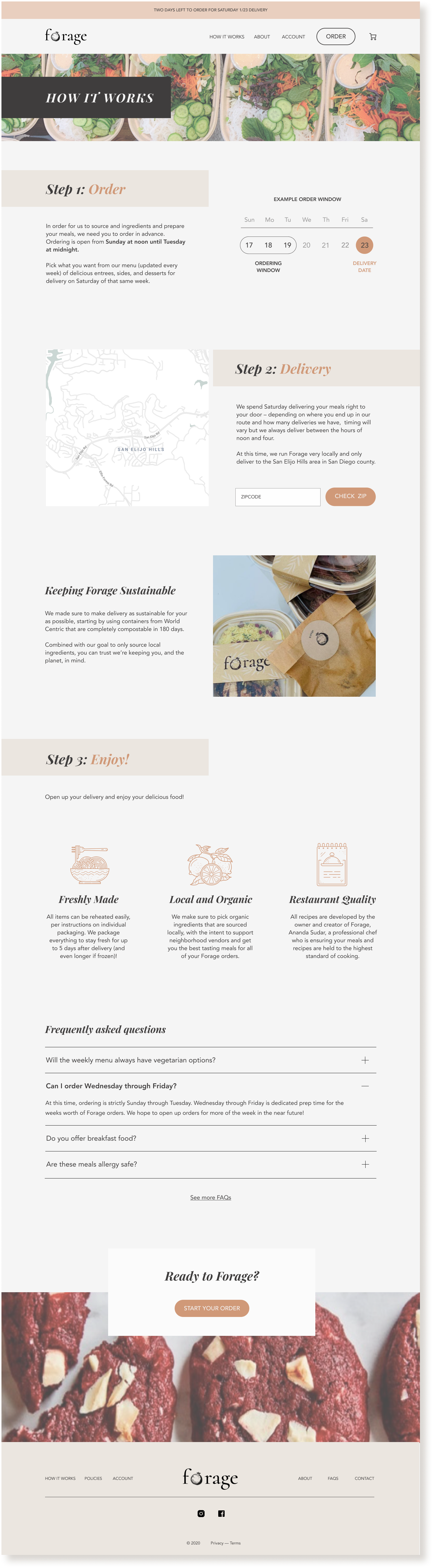
How it works page adjustment
As indicated throughout the testing process, it was clear that the How it Works page needed the most focus in the priority revisions. Specifically, the ordering process needed some further explanation or a different design.
In order to better explain the order window, I decided on adding in a visual element–this small calendar image will help users understand they are ordering in advance for meals to arrive Saturday/a few days later.
The rest of the page copy generally stayed the same, but I did adjust the layout to read more clearly as a breakdown of the three-step process.
Original How it Works page

Redesign after Usability Testing
Further revisions
Updating copy to indicate vegetarian options on landing page, so those with diet restrictions can know early that this service has delicious options for them.

Updating homepage to have photo of the business owner and chef, allowing users to put a name and face to who they are supporting.

Retrospective
Next steps
Expanding usability tests to mobile. I expect most users to be more comfortable ordering their food through their phones, especially during the pandemic with take-out deliveries. I think testing the mobile functionality would further help us fix any pain points in the current experience.
Complete the lower priority revisions. There were plenty of great insights from the usability testing that will have to come with more collaboration with the business owner, like solidifying product image branding and adding more prevalent information as the company grows.
Complete diary research testing. If I would have had more time, I would have liked to conduct a diary study during initial research, specifically with current Forage users. Hearing how users are feeling about the service in real-time would provide great insight for the business and future design revisions.
What I learned
I found that one of the biggest challenges in this project was designing for scale while the business is in such early stages of development. I was having to make design decisions based on the current service, but design a website that can handle a much larger user base. In reality, Forage still has a way to go until the business can transition fully to the website platform. I hope to help the business owner as it grows and make iterations for each stage.
